Project 02
Product Design · Fintech Onboarding
Jupiter — designing onboarding for a neobank
A product-design case study focused on onboarding, customer acquisition, new-user form fields, and iconography for a banking experience built around clarity and momentum.
Role
Experience design, product flows, UI recommendations
Focus
Onboarding, acquisition, form design, icon system
Output
Mobile flows, screen recommendations, visual system assets

Overview
Turning a complex banking signup journey into a clearer first-use experience.
The work centered on the moments that shape trust: the first onboarding screens, acquisition entry points, form-field clarity, and the visual language used to make financial actions feel approachable.
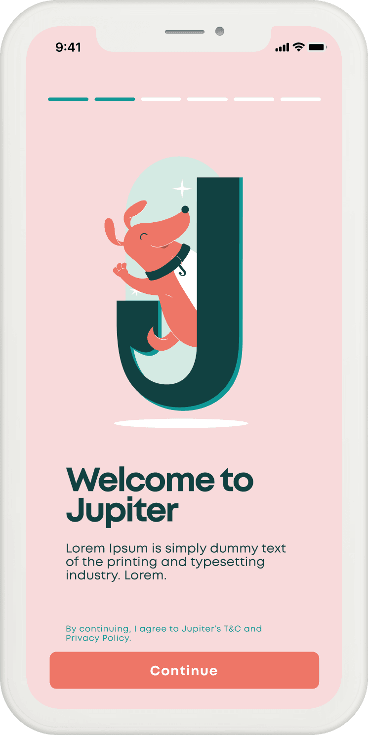
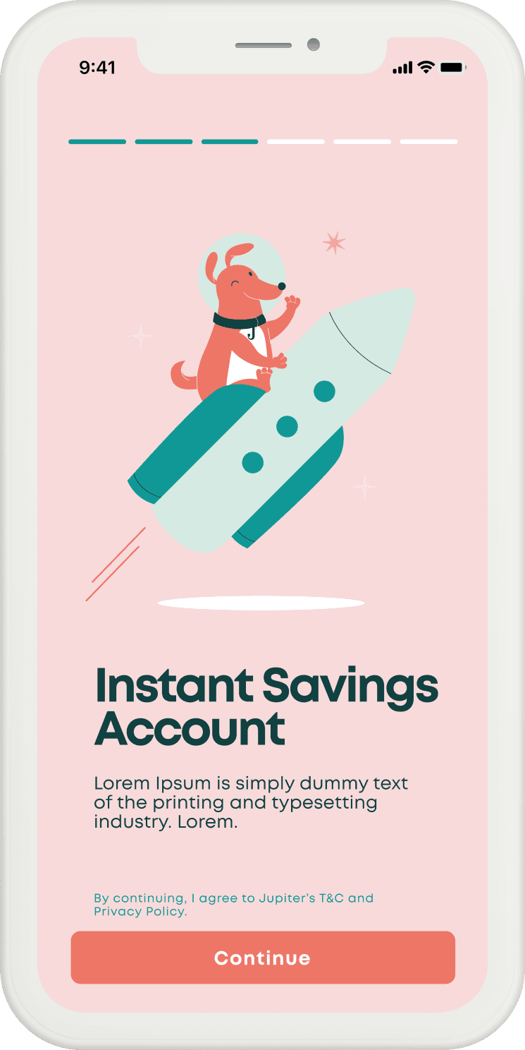
Onboarding
Reduce early friction while making the value proposition easier to absorb.
The onboarding recommendations emphasize scannable screens, shorter decision points, and visual continuity so users can understand what Jupiter offers before they are asked to complete heavier setup tasks.


Acquisition & Forms
Make signup feel guided rather than administrative.
Customer acquisition and new-user form fields were treated as part of the same trust-building sequence. The work clarified what information was needed, why it was needed, and how each step moved the user closer to an account.


Visual System
A supporting icon set gives the product language a friendlier cadence.
The icon work helped soften financial tasks without making them feel unserious. The system supports scanability across onboarding and reinforces a consistent, approachable product tone.

Reflection
The strongest design opportunity was not only to shorten the flow, but to make each moment feel more transparent. In a banking product, clarity is a trust feature.