Reimagining Digital Banking for India’s Next-Gen Users
Designing a faster, clearer account-opening flow for India’s fastest-growing neobank.
Project snapshot
01 / THE BRIEF
Remove friction without losing trust
Jupiter needed to make a high-stakes banking task feel light and transparent. The goal was to help new users understand the product, feel safe sharing sensitive information, and open an account in under five minutes.
< 5 min
Target account-opening time


02 / KEY INTERVENTIONS
Reassurance, designed into the flow
Focused verification steps, plain-language microcopy, consistent layouts, and contextual cues made onboarding feel guided rather than transactional.

01 Plain-language microcopy
02 Explain why information is needed
03 One focused action per screen
03 / FORMS & MICROCOPY
Forms that explain themselves
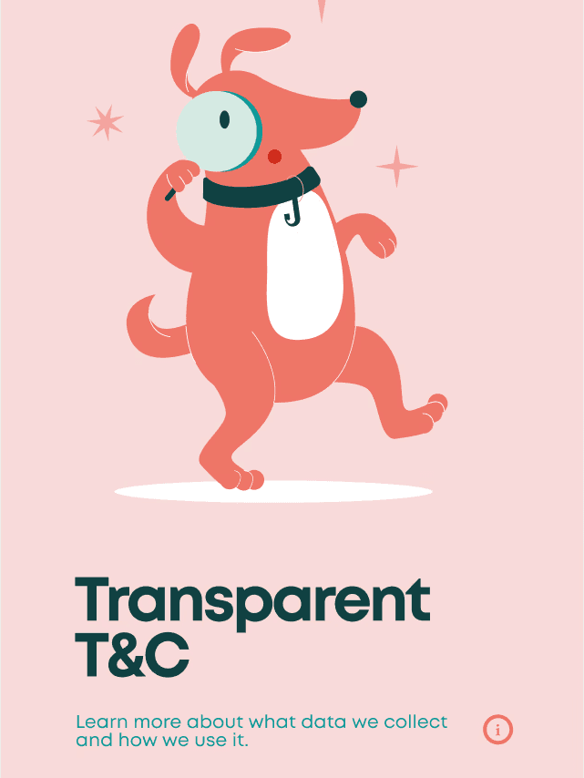
I worked with research to refine microcopy, explain the why behind important fields, and keep every step visually focused with clear actions and minimal distraction.

< 5 min
Account-opening time
200k+
Early adopters in the first few months
04 / OUTCOME & IMPACT
Faster completion. Stronger first impressions.
The flow combined product clarity with a recognisable visual system, helping new users move confidently from first screen to account creation.
Introduction
Jupiter is a mobile-first neobank built to make banking feel simpler, faster, and more transparent. It aims to provide a smooth, quick and hassle free digital banking experience for its users.
Following are the project goals:
To create an engaging and user-friendly experience
Build trust with users
Enable users to open a bank account in under five minutes
In my role as a designer, I was responsible for designing:
Customer onboarding screens
Customer acquisition flows
New user form field designs
And an icon set for the app interface
#1 - Customer Onboarding Experience
Introducing Jupiter with clarity and momentum
The primary requirements here were to:
Introduce users to the main product features and give them a clear picture of the privacy policies.
Build trust from the very first screen since this is a relatively new banking experience.
Another key requirement was to engage the user. Opening a bank account is quite tedious and frustrating, I had to simplify it and make it a fast yet delightful experience.
Action
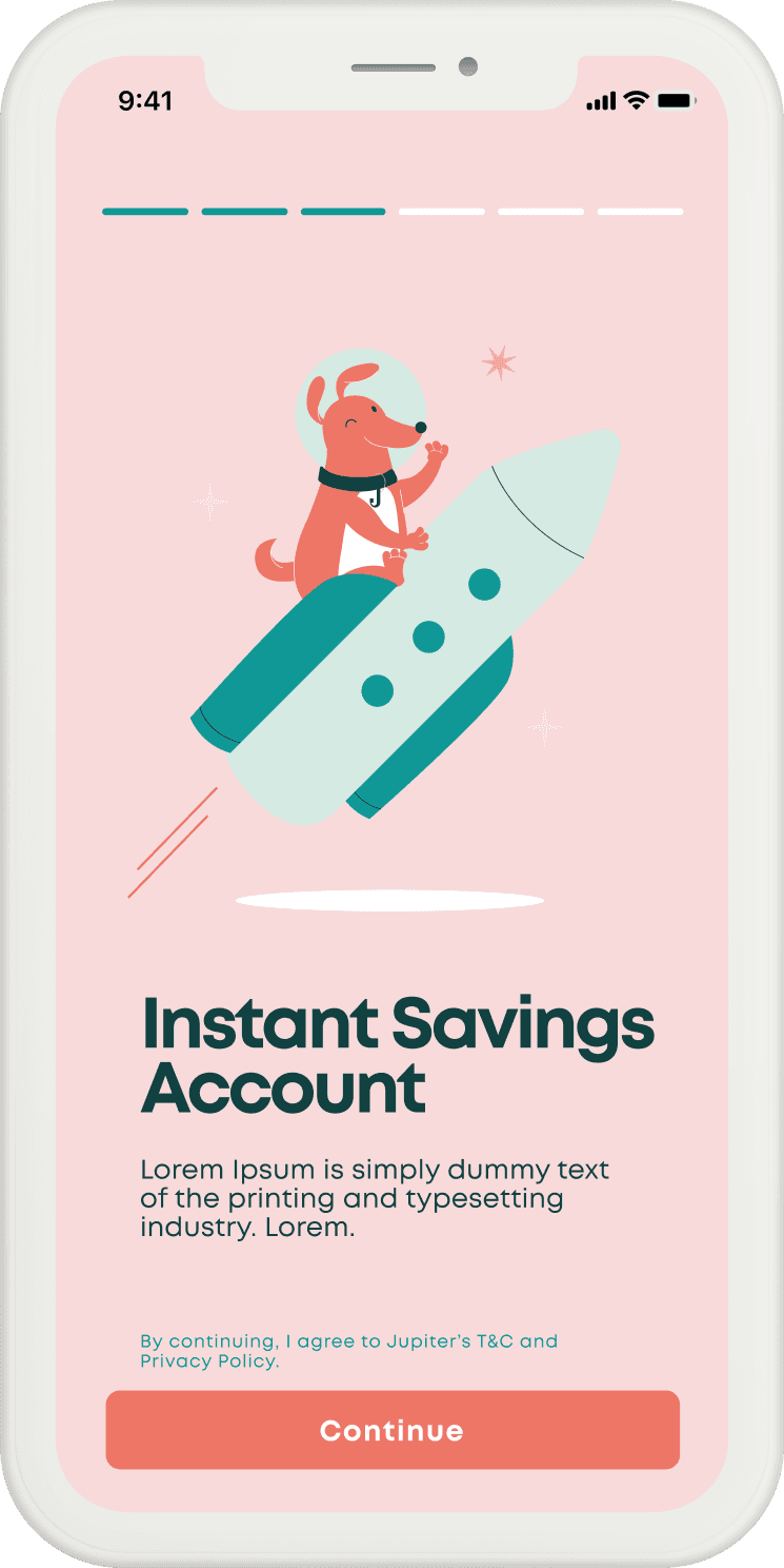
This stage was more about visual communication and communicating the product features.
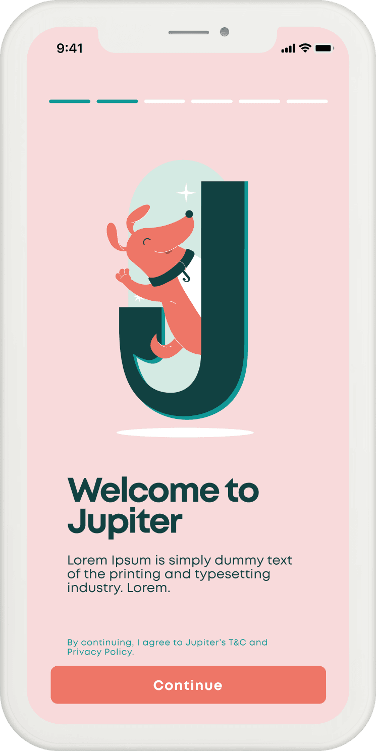
I used clear progress indicators, concise feature messaging, and Jupiter’s cheerful visual language to create an onboarding flow that felt light, guided, and reassuring from the first screen.
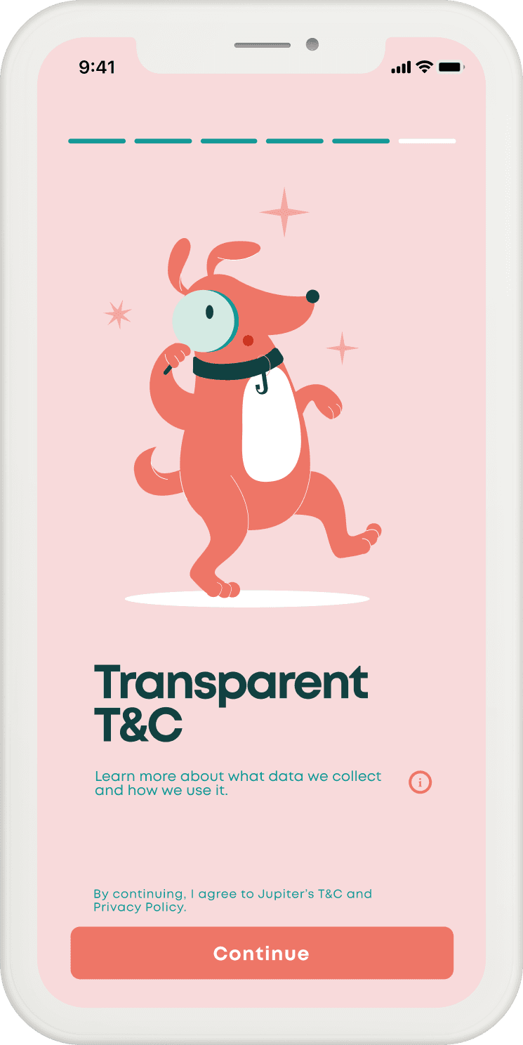
Progress bar
Intuitive indicators to help orient users to where they are in the onboarding journey. To create a clear path to completion and a greater sense of progress.
The brand mascot adds warmth and personality to an otherwise functional banking task.
Trust indicators: (i) icons
Information icons with more info. about user details the app asks for and how they would be used.

#2 - Customer Acquisition
Making sensitive data entry feel safer and easier
Situation
In this stage of the user journey, it is important to efficiently collect and register key user information.
Since the app will need to send messages from the phone’s messaging app, it is also important to communicate this efficiently so it doesn’t feel abrupt and unsafe.
Action
Opening a bank account requires users to share high-trust information like identity, tax, and verification details. The experience needed to feel secure without becoming heavy or intimidating.
Further, we provide an option to capture data from Credit Bureaus to speed up the onboarding process. Security is key at moments like this.
Result
Through the above steps, and through interspersed confirmation screens, we were able to reduce both the perceived duration and also the actual time taken to onboard users.

#3 - New User form fields
Designing Forms that explain themselves
Task
The form experience needed to feel simple, direct, and reassuring — especially when asking users for personal information.
Action
I worked with the research team to refine microcopy, explain the “why” behind important fields, and keep each step visually focused with clear actions and minimal distractions.
Further, to achieve these goals I worked with the research team to refine microcopy, explain the “why” behind important fields to express our transparency.
Result
I was able to create a clear and intuitive form flow that made it really easy for users to provide their personal details.
This helped make the final onboarding steps faster to complete and more comfortable for new users.
We received great feedback from beta testers who appreciated the simplicity, warmth, and increase in perceived trust based on first impressions.


Impact
The onboarding experience enabled users to open a Jupiter account in under 5 minutes.
Jupiter onboarded over 200,000 early adopters within the first few months of launch, with strong feedback on clarity, usability and trust.
Learnings & Takeaways
This project highlights the importance of small interface decisions. Elements like progress indicators, field explanations, visual consistency, and tone shape the users confidence in the product, especially in the banking space where trust is key.
It also reinforced how product design and brand expression work together to create a cohesive user experince.
Team
Design team -
Karno Guhathakurta, Design Lead
Kassandra Fernandes, Branding
Aashna Jain, Branding
Jiten Thakkar, UI & UX
Research & Strategy team-
Ashish
Gautam Chaddha